RockWorks | Utilities | 3-D | Points
Use this program to display XYZ points as spheres or cubes in a 3D display. Both simple and advanced display options are available. This tool can be a helpful way to visualize control points in 3D, and they can be appended to interpolated solid models in RockPlot3D.
Feature Level: RockWorks Basic and higher
Menu Options
Step-by-Step Summary
- Rules & Filters
Use the tabs at the top of the window to apply spatial filters, time/date filters, or stratigraphic rules to data being displayed in your 3D layers. (More info)
- 3D Log Design
If you decide to include logs with this diagram ("Striplogs" setting, below), click on this tab at the top of the window to set up how you want the 3D logs to look.
See Visible Item Summary and Using the 3D Log Designer for details.
- Data Columns: Click on this tab to select the names of the columns in the current datasheet where the input data is listed.
- X (Easting): Select the column in the datasheet that lists the X (Easting) coordinates for the points.
These can be Eastings in meters or feet, decimal longitudes, etc. See Defining your Datasheet Coordinates for more information.
- Y (Northing): Select the column in the datasheet that lists the Y (Northing) coordinates for the points.
- Z (Elevation): Select the column in the datasheet that lists the Z (elevation) coordinates for the points.
Be sure you've defined these elevation units.
- Style
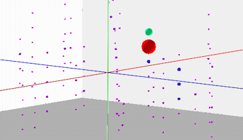
- Simple: Click in this button to create the 3D Point Map using basic settings. This will result in the points being represented by equally-sized red spheres.
- Advanced: Click in this button to create the 3D Point Map using more advanced settings.
- Symbol Type: Click here to select the symbol style you prefer.
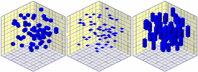
- Spheres: Choose this option to display the points using spheres or "oblates" (squished spheres).
-
- Cubes: Choose this option to display the points using cubes or "parallelepipeds" (squished cubes).
-
- Size & Color: Click on this tab to define how the symbols are to be sized and colored.
- Vertical Scaler: The vertical dimensions for the symbols will be multiplied by this number. It is useful when the vertical exaggeration for the output will be changed. If, for example, you will be stretching your 3D diagram vertically by a factor of 2, you can enter 0.5 to this prompt to keep the symbols looking like spheres.
- Independent: Choose this option to define the color and size separately. Click this tab to access the options.
- Size
- Uniform: Choose this option to have all symbols drawn to the same size.
- Size (% of Project Size): Click to the right to define the size of the symbols, as a percent of the dimensions of your project.
- Column-Based: Choose this if you have the symbol size listed in a column in the datasheet.
- Size Column: Click to the right to select the name of the column where the sizes are listed.
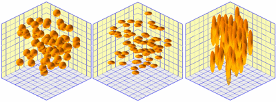
- Proportional: Choose this option for the symbols to be scaled based on a measured value at that point. For example, if the XYZ points represent earthquake epicenters, you could use the earthquake's magnitude at that location to define the symbol size. (In other words, high values would generate large symbols.)
- Data Column: Click to the right to select the name of the column in the datasheet that contains the measured value to be used to scale the symbols.
- Minimum Size (% of Project Size): Type in the size for the symbols (as a percent of the project extents) at the locations where the minimum Magnitude values are recorded.
- Maximum Size (% of Project Size): Enter the size for the symbols (as a percent of the project extents) at the locations where the maximum Magnitude values are recorded. Points with values intermediate to the minimum and maximum will be scaled proportionally.
- Color
- Uniform (all symbols have same color): Choose this option if all symbols are to be displayed in the same color. Click on the color box to select the color.
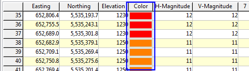
- Column-Based: Choose this option if you have colors defined for the points in the datasheet.
- Color Column: Click here to select the name of the column that contains the colors. An example of a color column is shown below.
-
- Proportional: Choose this option to have the symbols color-coded using a cold-to-hot color scheme based on a measured value at each point. For example, if the XYZ points represent earthquake epicenters, you could use the earthquake's magnitude at that location to define the symbol color. (In other words, low values would generate blue symbols and high values red ones.)
- Column: Click to the right to select the name of the column in the datasheet that contains the measured values to be used to color-code the symbols.
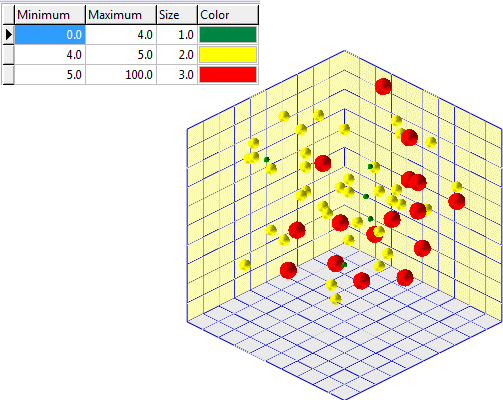
- Table-Based: Choose this option to standardize the size and colors of symbols based on a special "lookup-table" and a designated column within the main datasheet. For example, notice how values within the following example that have a magnitude between four and five appear as medium-sized yellow spheres.
- Data Column: Click to the right to select the name of the column in the datasheet that contains the measured values to be used to color and scale the symbols.
- Lookup Table: Click to the right to select the name of the 3D Point Map Range table which contains the list of values to be represented with a specific symbol size and color. All of the 3D Point Map Range tables in the current project will be displayed in this list. If none are shown, then you can create one by clicking the New Table button. These tables are stored in the project database.
- Labels: Check this box to include labels adjacent to each sample point. In the case of earthquakes, these labels might show the date or the magnitude. In the case of geochemistry, these labels might show the geochemical levels, and so on.
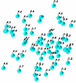
- Label Column: Click here to select the name of the column within the datasheet containing the information to be depicted by the label.
- Font: Click on this button to define the font style, size, and color for the label.
- Label Offset: The offset defines the distance (as a percent of the horizontal diagram diagonal) between the symbol midpoint and the label.
- Leader Lines: If checked, this setting will draw a line from the symbol midpoint to the label.
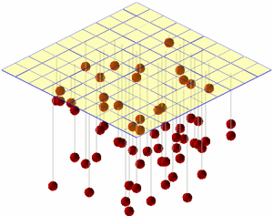
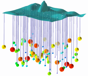
- Connectors: Check this box to include connectors in your 3D scene. Connectors are either vertical lines, tubes, or cones that connect a symbol with an set elevation or a gridded surface. They are used to register points with their corresponding horizontal location on a surface.
- Connector Color: Use this setting to define the color that will be used to plot the connector.
- Connector Style: Connectors may be one of three types:
- Line: The connector will be displayed as a single-pixel line.
- Tube: The connector will be displayed as a tube whose radius is defined by the user.
- Tube Radius: The radius of the tube is defined as a percentage of the horizontal project size.
- Cone: A cone will be displayed such that the base is a positioned at the specified surface elevation (see below) while the tip will be positioned at the symbol midpoint.
- Cone Radius: This is the cone base radius. It is defined as a percentage of the horizontal project size.
- Surface Elevation: The surface elevation defines the starting point for a connector while the symbol midpoint defines the other endpoint. There are two methods for defining the surface elevation:
- Fixed: The Fixed option is used to define the surface as a horizontal plane at a user-specified elevation (see the line-connector example above).
- Elevation: Elevation for fixed horizontal surface.
- Variable: The Variable elevation option will use a grid model to define the surface from which the connector will be drawn.
- Grid Model Name: The Grid Model Name defines the grid model that will be used as the surface from which the connector will be drawn.
-
- Other 3D Diagram Options
Use these checkboxes to append other layers to your 3D scene.
Click each tab to set up the 3D diagram layers (images, infrastructure, reference cage, etc.).
- Output Options: Use these settings to define whether the output scene is to be saved (or displayed as "untitled"), how the file should be named, and whether it is to be displayed after it is created. It also offers export options. (More info)
- Access the RockWorks Datasheet program tab.
- Create a new datasheet and enter or import your listing of XYZ locations, and optional "magnitudes" and colors into the datasheet.
Or, open one of the sample files and replace that data with your own. See Data Layout for datasheet examples.
! Click the Example button at the top of the window to load a sample file that is installed with the program.
- Select the Utilities | 3-D | Points menu option.
- Enter the requested menu settings, described above.
- Click the Continue button to proceed.
RockWorks will read the indicated XYZ location coordinates and plot a 3D sphere or cube symbol in the declared color and size, at those locations. They will be displayed in a RockPlot3D tab in the options window.
- You can adjust any of the settings in the main Options tab to the left and then click the Continue button again to regenerate the 3D point map.
- View / manipulate the image in RockPlot3D.
 Back to 3-D Menu Summary

RockWare home page