RockWorks | Utilities | Stats | Histogram Matrix
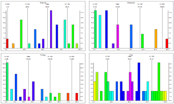
This program is used to read two or more adjacent columns of data from the datasheet and, for each, determine the frequency or percentage of the total number of measurements for that variable that falls in each user-defined grouping or "cell." For each column of data, these values are represented as a bar histogram plot. The 2+ histogram plots are combined for display in a single diagram. This is a very handy way to compare multiple related datasets quickly and graphically.
Feature Level: RockWorks Basic or higher
Menu Options
Step-by-Step Summary
- Data Columns: Use these prompts to define the data to be processed.
- Start: Select the first (lefthand-most) column containing the data values to be read and displayed in a histogram plot.
- End: Select the last (righthand-most) column of data values to be read. The program will create a histogram plot for the starting column, ending column, and all columns in between. See Inserting Columns and Deleting Columns if you need to reorganize your datasheet.
- Layout
- Diagrams per row: Enter the number of histograms to be plotted horizontally before a new row is begun.
- Width:Height Ratio: Enter a specific size ratio for the graph, excluding the legend. The default value is "2.0" which will generate graphs twice as wide as they are high.
- X-Spacing (% of Width): This defines the spacing of the individual histograms across the composite diagram, as a percent of the diagram width.
- Y-Spacing (% of Width): This defines the spacing of the individual histograms across the composite diagram, as a percent of the diagram height.
- Annotation
- Plot Statistics: Insert a check here to include labels that represent the groupings of histogram bars into mean + and - 1SD, 2SD, 3SD and 4SD. These would correspond to the anomalous colors above. Click the button to establish the label color and size (as a percent of diagram width.).
- Plot X Axis Labels: Check this item to plot labels along the bottom axis that represent the real number units of the variable being plotted. Click the button to establish the label color and size (as percent diagram width).
- Plot Y Axis Labels: Check this to plot labels along the vertical axis that represent the frequency units. Click the button to establish the color, size and units.
- Plot as Percentages: Check this item if you want the units to represent percent. If this box is cleared, the units will represent actual occurrences.
- Y-Axis Scaling
- Automatic: Select this for the program to determine automatically the vertical scale of the histogram bins, based on the data range.
- Manual: Select this item to enter your own maximum value for the histogram bins.
- Scaling + Bin Size: Click here to designate the width of each histogram bin as they will be displayed on the histogram plot, and to determine whether the bins are to be displayed at a linear or logarithmic scale. The scaling scheme you select will determine your options for selecting the bar widths. (More info)
- Bin Colors: Click here to select how the histogram bars are to be filled. (More info)
- Legend: Insert a check here to include a legend listing a statistical summary for the data.
Click this tab to access the legend layout options. (More info)
- Other 2D Files
Check this option to include existing RockWorks diagrams as layers with the current diagram.
Click on this tab to select the existing diagrams (.Rw2D files) to be included. (More info)
- Peripherals
Check this option to include various peripheral annotations with your diagram. Options include titles, scalebars, and more.
Click on this tab to activate the items and establish their settings. (More info)
- Border
Check this option to include a solid line border around the entire diagram.
Click on this tab to specify the line style, thickness, and color.
- Output Options: Use these settings to define whether the output graphic is to be saved (or displayed as "untitled"), how the file should be named, and whether it is to be displayed after it is created. It also offers export options. (More info)
- Access the RockWorks Datasheet program tab.
- Create a new datasheet and enter or import your image names and dates into the datasheet.
Or, open one of the sample files and replace that data with your own. See Data Layout for datasheet examples.
! Click the Example button at the top of the window to load a sample file that is installed with the program.
- Select the Utilities | Stats | Histogram Matric menu option.
- In the displayed dialog box enter the requested information, discussed above.
- Click the Continue button to proceed.
RockWorks will read the real number values from the requested datasheet columns. For each data column, the program will determine the number of samples that fall into each of the histogram "bins," counting them either as actual frequencies or as percent. The completed histogram plots will be compiled into a single diagram and displayed in a RockPlot2D tab in the Options window.
- You can adjust any of the diagram settings via the Options tab to the left (adjust color scheme, change scaling, etc.) and then click the Continue button again to regenerate the histogram matrix.
- View / save / manipulate / print / export the diagram in the RockPlot2D window.
 Back to Statistics Menu Summary
RockWare home page