
Frequency histograms are used to get a general summary of the value distribution within the borehole database, a data file, a grid model, a solid model, etc. The summary is displayed as a plottable frequency histogram of the values, reported as numbers or percent.
These settings are shared by all of the histogram tools in the program.
- Titles:
- Primary Title: Click to enter the text, if any, for the main title at the top of the diagram. This can be left blank for no title. Click the button to the right to set the text color and size, as a percent of the diagram width.
- Secondary Title: Click to enter the text, if any, for the secondary title. This can be left blank for no title. Click the button to the right to set the text color and size, as a percent of the diagram width.
- Scaling + Bin Size: These settings determine the width of each histogram bin as they will be displayed on the histogram plot, and to determine whether the bins are to be displayed at a linear or logarithmic scale.
- Linear scaling:
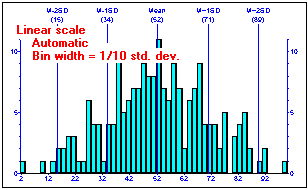
- Choose Automatic if you want the program to set the bin width automatically. For linear plots, the histogram bars will be set to 1/10 the standard deviation. Example:
-
- Choose Manual to override the automatic settings, for linearly-scaled plots. Enter this in terms of the variable's actual units, as represented along the x-axis. Example:

- Logarithmic Scaling:
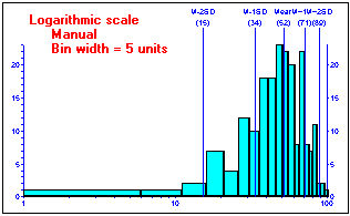
- Choose Automatic if you want the bins to represent equal sampling ranges and to be sized automatically to 1/10th the standard deviation. In this example the bins represent equal sampling ranges and will be sized automatically to 1/10th the standard deviation. Compare this method (left) versus the Automatic Linear method (second). Both contain bins of 1/10th the standard deviation.
-

- Choose Manual if you want the bins to represent equal sampling ranges but want to establish the width manually. Enter this in terms of the variable's actual units, as represented along the x-axis. Example:
- Confirm Range: Insert a check here to see / override the data range before plotting.
- Bin Colors: Click this tab to select how the histogram bars are to be filled.
- Monochromatic: Click in this radio button to have all bins colored the same. Expand this heading to select a color to be used, by clicking on the Color box.
- Discrete: Colors are varied, based on statistics. You can choose a different color for the following bin types:
- Background: Represents mean + one standard deviation (1SD) and mean - 1SD. These samples show no anomaly.
- Slightly Anomalous: Represents mean - 1SD to mean - 2SD and mean + 1SD to mean + 2SD. These samples show slight anomaly.
- Moderately Anomalous: Represents mean - 2SD to mean - 3SD and mean + 2SD to mean + 3SD. These samples show moderate anomaly.
- Strongly Anomalous: Exceeds mean - 3SD and mean + 3SD. These samples show strong anomaly.
- Continuous: Colors are varied, ranging from cold to hot for low-to-high values.
- Filtering
- Minimum Cutoff:
- Maximum Cutoff:
- Legend: Insert a check here to include a legend listing a statistical summary for the data.
Click this tab to access the legend layout options.
- Width: Set the width for the legend as a percent of the output diagram width. (Default = 30)
- Horizontal (X) Offset: This setting determines how far, as a percent of the diagram width, the legend is to be offset from the main diagram. The greater the value you enter, the further the legend will be offset from the diagram. (Default = 2)
- Height: Set the height for the legend as a percent of the output diagram height. (Default = 100)
- Vertical (Y) Offset: Determines how far, as a percent of the diagram height, the legend is to be offset vertically in relation to the diagram. (Default = 0)
- Plot Legend Title: Check this box to display a title label at the top of the legend. Enter the title text into the prompt, and click the color box to choose the text color.
- Plot Border: Check this box to include a line border around the legend. Click the box to the right to select the line style, thickness, and color.
- Plot Horizontal Dividers: Check this box to plot horizontal lines between each line of text. Click the box to the right to select the line style, thickness, and color.
- Plot Vertical Divider: Check this box to include a vertical divider line between the two columns of text in the legend. As for the others, click the box to the right to access the line options.
- Left Text Column: Click Left, Cneter, or Right for the text-justification of the labels in the left column of the legend. Choose the color for the text using the color box.
- Right Text Column: Click Left, Cneter, or Right for the text-justification of the labels in the right column of the legend. Choose the color for the text using the color box.
- Aspect Ratio: Check the Fixed Aspect box to assign a specific width:height ratio, and enter that number in the prompt. The default is "2" meaning that the diagram will be twice as wide as it is tall. Increase this value to make a wider, flatter diagram. Decreast this number to create a taller, narrower diagram.

RockWare home page