RockWorks | Utilities | Maps | Piecharts
This program reads location data and values for up to 9 selected variables from the Utilities datasheet, and generates a map that illustrates the relative percentage of the selected variables as varying-width pie "slices" at each sample location. The resulting map is displayed in RockPlot2D.
Menu Options
Step-by-Step Summary
- Spatial Filter: Insert a check in this box at the top of the program window to activate a data filter based on spatial coordinates. Click this button to enter the filter settings. Click the Return to Previous Menu button when you are done entering the filter settings. (More info)
- Time Filter: Insert a check in this box at the top of the program window to filter the borehole Aquifer or T-Data based on date/time. This only applies to the Borehole Locations overylay layer, if activated. Click this button to enter the filter settings. Click the Return to Previous Menu button when you are done entering the filter settings. (More info)
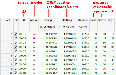
- XY Columns: Use these prompts to tell RockWorks which columns in the input datasheet contain the input coordinates.
Click on an existing name to select a different name from the drop-down list. See a sample data layout below.
- Easting (X): Column that contains the X coordinates for the sample locations.
These can be Eastings in meters or feet, decimal longitudes, etc. See Defining your Datasheet Coordinates for more information.
- Northing (Y): Column that contains the Y coordinates for the points.
- The columns containing the values to be represented in the piecharts are defined below.
- Components: Click this tab to select the items to be represented in the piecharts.
- Plot Component # 1 - Plot Component # 9: You can request up to 9 components be represented in the small bar charts by inserting a check in the appropriate check-box. For each component that you activate, choose the data source and color.
- Data Column: Click on the drop-down prompt to select the name of the column containing the data listing for that component.
- Color: Choose the color for that component's pie slice.
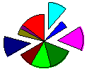
- Explode: Insert a check in this box if you want that component to be positioned slightly away from the rest of the sample's circle, to make it more visible. You can "explode" as many components as you wish.
-
- Diagram Options
- Dimensions
- Fixed: Click in this radio button for all of the piecharts to be the same size.
- Size: Click here to specify a size for each pie chart, expressed as a percent of the map width. Default = 2.0.
- Variable: Click in this radio button for the piecharts to vary in size, based on data in the datasheet.
- Column that defines size: Select the name of the datasheet column that contains numeric values which will define the piechart size.
- Scaling Method: There are three different methods for sizing the diagrams based on a designated data column.
- Multiply By Scale Factor: The value within the designated column will be multiplied by a specified scale factor.
- Compute Natural Logarithm: A useful tool for automatically scaling diagrams without huge ranges (think mega-outliers) is to instruct the program to first compute the natural logarithm of the data within the data column.
- Scale Factor: The data within the designated sizing-column will be multiplied by this number. Note: If the Compute Natural Logarithm option has been enabled, the scale factor will be applied AFTER the natural logarithm has been computed.
- Normalize To Data Range: This option will scan all of the data within the designated column to determine the range of values. The data will then be normalized between zero and 1.0. These are the values that are multiplied by the associated Minimum Size and Maximum Size settings to determine the diagram dimensions.
- Minimum Size: Mininum diagram size in terms of the project's diagonal extents.
- Maximum Size: Maximum diagram size in terms of the project's diagonal extents.
- Defined By Lookup Table: The diagram dimensions will be determined by a lookup table in which minimum, maximums, and diagram sizes are specified for an unlimited number of discrete intervals. For example, if the data column used for sizing falls between 100 and 500, the diagram for that row of data will have a radius of 0.1 (as expressed in terms of the Project Diagonal). Note: Although this method is more cumbersome to the other options, the benefits are significant.
- Table Name: Click the Edit button to select the name of the scaling table to be used. (More info)
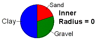
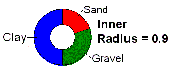
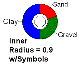
- Inner Radius: Click here to set the inner radius of your pie charts. The default size is 0.0, which will create "closed" pie charts. By increasing this radius value, you can create "open" pie charts which would allow point map symbols to be displayed within them, if you were to combine your pie chart map with a standard point map in RockPlot2D. The Radius is expressed as a percent of the map's diagonal extents.
-
- Plot Labels: Insert a check here if each pie slice in the charts is to be labeled with its component's name.
- Orientation: Choose from Horizontal (shown above) or Radial (which will look like bicycle spokes).
- Font: Click on the button to enter the label color and size as a percent of the map width.
- Offset: Use this setting to increase/decrease the offset of the label from the diagram.
- Automatic Offset: Check this box to have the program automatically offset the piecharts such that they do not overlap adjacent piecharts. Click on this tab to set up the offset parameters. (More info)
- Map Layers: Select the additional layers you wish to incorporate into the map, inserting a check-mark in those you wish to include. Establish the settings for each activated layer, such as a background image, axis labels, etc. See 2D Map Layers for more information.
- Output Options
- Save Output File: Check this to assign a name for the map in advance, rather than displaying it as Untitled.
- Automatic: Choose this option to have RockWorks assign the name automatically. It will use the name of the current program plus a numeric suffix, plus the ".Rw2D" file name extension.
- Manual: Choose this option to type in a name of your own for this file.
- Display Output: Check this option to have the resulting map displayed in RockPlot2D once it is created.
- Access the RockWorks Datasheet program tab.
- Create a new datasheet and enter or import your data into the datasheet.
Or, open one of the sample files and replace that data with your own. See Data Layout for datasheet examples.
! Click the Example button at the top of the window to load a sample file that is installed with the program.
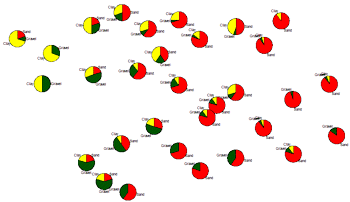
This example illustrates the sample file "RockWorks Data\Samples\Soil_Properties_01.rwDat".
Longitude and latitude coordinates must be in decimal format. If you're using another coordinate system, be sure you've specified the Units and the Projection Settings as appropriate.
- Select the Utilities | Maps | Piecharts menu option.
- Enter the requested menu items, discussed above.
- Click the Continue button to proceed.
To build the map, the program will read the selected components from each row in the datasheet. For each sample it will normalize the component values to add up to "100%", and then represent their relative proportions as variable-width pie slices at each map location, using the color, labeling, and other parameters you selected. The completed map will be displayed in a RockPlot2D tab in the options window, if requested.
- You can adjust any of the settings in the Options window (radius, colors, etc.) and then click the Continue button again to regenerate the map.
- View / save / manipulate / export / print the map in the RockPlot2D window.
 Back to Map Menu Summary

RockWare home page