RockWorks | Borehole Operations | Aquifers | Hydrograph Billboards
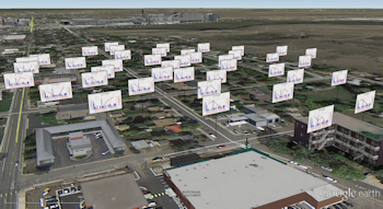
This program is used to read water levels for a specified aquifer from the borehole database for all enabled boreholes, and precipitation data from the RockWorks datasheet, and create mini-hydrograph diagrams as vertical "billboards" at each borehole location, for display in Google Earth. The individual diagrams use the same settings as those in the Utilities | Hydrology | Hydrograph program; the primary difference is that the Aquifers menu program reads the water level data from the Water Levels table within the Borehole Manager database.
See also
Single-Borehole Hydrographs
Hydrograph Maps
Feature Level: RockWorks Standard and higher
Menu Options
Step-by-Step Summary
- Data Columns: Since the borehole database does not contain precipitation information, it's necessary to list this data in the RockWorks datasheet. These prompts are used to specify which column in the datasheet contains the requested information.
- Date: Click here to select the column in the RockWorks datasheet that contains the listing of dates on which the precipitation measurements were made. The dates must be sorted in ascending order. The date format should be either mm/dd/yyyy or dd/mm/yyyy, to match your Windows date format. The years should be entered with 4 digits. Listing of time notations is optional and would only be applicable when more than one measurement was taken on a single date. During construction of the hydrograph diagram, you may request the axes be labeled at sampling time, or at minute, hour, day, or month intervals. Times may be entered using "am" or "PM" notations (not case-sensitive) or using a 24-hour format. If no "am" or "pm" are present, 24-hour format is assumed.
- Precipitation: Click here to select the column in the datasheet that contains the listing of precipitation measurements. These measurements need not be listed for each listed date. Precipitation amounts can be entered in any real number units. During creation of the diagram, you may enter unit labels for the axes.
- Diagram Options: Click this tab to select the aquifer to be graphed, and other diagram options.
- Aquifer: Click to select which aquifer is to be represented in the hydrograph billboards.
- Main Title: Type in the text, if any, that you want to appear at the top of each hydrograph diagram. The program will plot up to 60 characters (alphanumeric) for the title.
- Color: Click to select a color for the title text.
- Include Borehole Name: Check this box if the name of the borehole should be included in front of the title text.
- Precipitation: Use the settings in this column to establish how the precipitation data will be plotted.
- Axis Title: Enter the text to be plotted along the left side of each diagram such as "Precipitation," in the same color as the precipitation data and noting the representative line or bar pattern, if any.
- Plot Symbols: Insert a check here if the precipitation data are to be represented by symbols.
- Symbol Type: Select the symbol style and color. The symbols can be plotted alone or with a point-to-point line, below.
- Connect Points: Insert a check here if you are displaying symbols (above) and want them to be connected by lines.
- Polyline Color: Click to select the color for the line.
- Polyline Thickness: Select the thickness for the line (1 = thin, 3 = thick).
- Plot Bargraph: Insert a check here if the precipitation data are to be represented by a bar histogram. This is the default setting.
- Bargraph Pattern: Click the sample box to choose the fill pattern and color.
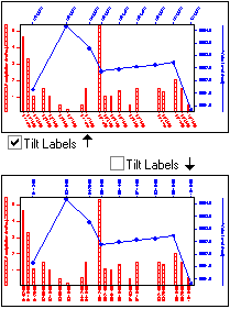
- Tilt Labels: Choose whether the precipitation date labels should be tilted (checked) or vertical (unchecked).
- Water Levels: Use the settings in this column to establish how the water level data will be plotted.
- Axis Title: Enter the text to be plotted along the right side of the diagrams (such as "Water Level") in the same color as the water level data and noting the representative line or bar pattern.
- Plot Symbols: Insert a check here if the water level data are to be represented by symbols. This is the default setting for water level data.
- Symbol Type: Select the symbol style and color. The symbols can be plotted alone or with a point-to-point line, below.
- Connect Points: Insert a check here if you are displaying symbols (above) and want them to be connected by lines.
- Polyline Color: Click to select the color for the line.
- Polyline Thickness: Select the thickness for the line (1 = thin, 3 = thick).
- Bargraph: Check this box if the water level data are to be represented by a bar histogram.
- Bargraph Pattern: Click the sample box to choose the fill pattern and color.
- Tilt Labels: Choose whether the water level date labels should be tilted (checked) or vertical (unchecked).
- Symbol + Label Dimensions: Choose from Small, Medium, or Large. This will affect the titles, label text, and point symbols.
- Bargraph Column Width: Select a width.
- Intervals
- Labeling: Choose the intervals to be used for the precipitation measurement dates (bottom axis of the graph) and the water level measurement dates (top axis of the graph).
- Tick Marks: Choose the intervals to be used for the precipitation tick marks (bottom axis of the graph) and the water level tick marks (top axis of the graph). You may set the labels and the tick marks to different increments.
- The Samples option will plot the date and/or tick mark for each record in the datasheet (precip) or database (water levels). This can be nice if you have few entries, but cluttered if you have many. This is the only scheme with which labels are not necessarily set to an even spacing. The remaining options will plot regularly-spaced data/time labels and tick marks at the interval entered at the Interval prompt.
- Minutes: If the dates in your datasheet (precipitation) or database (water levels) contain hour:minute:second notations, you might find it handy to include labels at minute intervals, with the increments entered in the displayed Interval prompt, below. For example, tick marks could be set to 10-minute increments and labels to 30-minute increments.
- Hours: If the dates in your datasheet (precipitation) or database (water levels) contain time notations, you can set the labels to hours, with increments entered in the displayed Interval prompt. For example, tick marks could be set to increments of 1 hour and labels to 6 hours.
- Days: With this setting, the axes will show a label for each day (if Interval is set to "1") or other day interval as specified.
- Months: With this setting the axis will display one label per month (if Interval = "1") or other month interval as specified.
- Interval: Click on the Interval item to type in the labeling increments and tick-mark increments. For example, if you have chosen the Days and set the Interval to "5", then the labels will appear every 5 days.
- Diagram Dimensions: This will determine the horizontal and vertical dimensions of your hydrograph plot in inches, excluding axis labels, titles, and diagram title. You can make the diagrams virtually any size you choose, as you may scale them up or down during printing from RockPlot.
- Axis Color: Click here to choose the color for the perimeter line around the diagram.
- Billboard Dimensions: Click this tab to view/adjust the Billboard settings.
- Units: Choose Feet or Meters by clicking in the appropriate radio button.
- Width: Type in the width, in the above units, for the billboards. For example, if you set the width to 50 meters, the billboards will plot that wide in relation to the ground in Google Earth.
- Elevation: Enter the offset above ground in the above units.
- Direction: Enter the left-to-right reading direction of the billboards, in a 0 to 360 azimuth format.
- Group clustered wells: Check this box if the billboards for proximal wells are to be combined into a single, stacked diagram.
- Group Name: Click this tab to enter the name for the group of map items in Google Earth.
- Output Options: Click on this tab to define the output file and display settings.
- Output File Name
- Automatic: Choose this option to have RockWorks assign the name automatically. It will use the name of the current program plus a numeric suffix, plus the ".KMZ" file name extension.
- Manual: Click this option to type in your own file name. The extension is ".KMZ".
- Display output within Google Earth: Check this box if you want to display the output at this time in Google Earth.
! Note that the actual program which will be used to display the KMZ file is determined by your Windows settings.
- Use Custom View: If unchecked, the starting viewpoint for the map will be determined automatically. If checked you can set a custom view.
-
- Longitude, Latitude: Type in the longitude and latitude coordinates where the viewpoint will be.
- Heading: Type in the 0 to 360 degree bearing from the viewpoint to the map.
- Tilt: Type in the angle downward from the viewpoint to the map.
- Range: Enter the distance in meters from the viewpoint to the map.
- If necessary, create a data listing in the RockWorks Datasheet in which precipitation measurements and dates are listed.
! Click the Example button at the top of the window to load a sample file that is installed with the program.
- Access the Borehole Manager program tab.
- Enter/import your data into the Borehole database, if you have not done so already. This program reads Location and Water Level data.
- Enable/disable the boreholes to be included in the billboards by inserting/removing the checks from their check-boxes.
- Select the Borehole Operations | Aquifers | Hydrograph Billboards menu option.
- Enter the requested program settings, described above.
- Click the Continue button to proceed with diagram generation.
RockWorks will generate the requested graph(s) for the enabled boreholes, storing them in a KML file inside a KMZ (zip) file. It will create a KMZ (zip) file containing the KML file. The Google Earth KML and KMZ file names will be assigned as you specified.
- The billboards will be displayed in Google Earth, if requested.
 Back to Aquifers Menu Summary

RockWare home page