RockWorks | Borehole Manager | Production | Multi-Well 3D Spindle Map
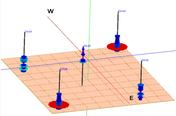
This program is used to read date-based oil and gas production data from the borehole database and create a 3D scene in which each measurement of a selected component is represented by a horizontal disk in which the radius is proportional to the magnitude of the parameters. The discs can be plotted in a single color or using a cold-to-hot color scheme.
Feature Level: RockWorks Advanced
Menu Options
Step-by-Step Summary
- 3D Spindle Options
- Data to Display
- Cumulative: To display cumulative measurements, click in one of the radio buttons in this list - Oil, Gas, Oil+Gas, Water, or Production Days.
- Average Daily: To display average daily measurements, click in one of the radio buttons listed here.
- Dimensions: Define the dimensions of the 3D spindles using these settings.
- Base Elevation: (Default = 0) Note that the vertical axis for these spindle diagrams represents time rather than actual elevations in your project area. The Base elevation you enter here will indicate how far above 0 the spindles will start and extend upward.
- Maximum Radius: Type in the maximum radius, as a percent of your project size, for the maximum measurement for the parameter you've selected. The measurement disks will be scaled proportionally from the axis outward to this maximum radius.
- Maximum Height: Type in the maximum height, as a percent of your project size, for the spindle diagrams.
- Spindle Colors:
- Continuous (Cold to Hot): Choose this option for the disks representing the lowest measurements to be drawn in cold colors (purples), grading through the color ramp to warm colors (reds) for the highest measurements.
- Formation Color: Choose this option to have the discs color-coded by formation, using the background color you've defined for the unit in the Stratigraphy Types table.
- Monochrome: Choose this option for all measurement disks to be drawn in the same color, defined using the color box.
- Axis:
- Color: Click this box to choose a color for the 3D spindle axes.
- Radius: Type in the radius for the axis tubes, as a percent of your project size. This should work proportionally with the maximum radius you've defined above.
- Plot Well Titles: Check this box to include the well names at the top of the axis. Click the button to select the font type, size, and color.
- Date Filter: Check this box to restrict the 3D spindle plots to a specific date range.
- Starting Date: Type in the starting date for the spindle data using a mm/dd/yyyy or dd/mm/yyyy format as is consistent with how your data is displayed in the database (per Windows date/number format).
- Ending Date: Type in the ending date for the spindle data using the same date format.
- Stratigraphy Filter: Check this box to plot the data listed for a specific formation. (If left unchecked, all measurements will be included, given the date filter, above).
- Filtering Formation: Select the name of the formation whose data is to be plotted. The formations listed here are pulled from the Stratigraphy Types Table.
- Miscellaneous:
- BOE Conversion Factor: Click to the right to type in the Barrel of Oil Equivalent conversion factor. Gas production values will be mulitplied by this value and added to the Oil production numbers to generate a total production value.
- Other 3D Diagram Options
Use these checkboxes to append other layers to your 3D scene.
Click each tab to set up the 3D diagram layers (logs, images, infrastructure, reference cage, etc.).
- Output Options: Use these settings to define whether the output scene is to be displayed after it is created. You can also define how/whether it is to be saved in the project folder. (More info)
- Access the Borehole Manager program tab.
- Enter/import your well production data into the database.
- Select the Production | 3D Diagrams menu option.
- Establish the program settings, discussed above.
- Click the Continue button to proceed.
The program will generate scaled 3D disks representing the measurements for the selected parameter for the enabled boreholes. It will plot them at the well locations in the 3D scene. Additional layers will be appended as requested, and the completed diagram will be displayed in a RockPlot3D tab in the Options window.
- You can adjust any of the diagram options in the man Options tab to the left and then click the Continue button again to regenerate the display.
- View / save / manipulate / print / export the map in the RockPlot3D window.
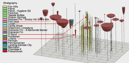
Let's take a minute to look at the diagram below and understand what we're seeing. The vertical axes represent time with the lowest elevation being 1999 and the highest being 2015. The inverted colored cones represent relative cumulative oil production. The yellow (D-Sand) and single orange (J-Sand) are old wells that started production in 1999. The lonely J-Sand well (orange) along the northern border only produced for a few years. The marginal D-Sand (yellow) wells have been continuously producing since 1999. The pink (Fort Hays Member of Niobrara Formation) and blue (Codell Sandstone) wells are less than ten years old but they've produced far more oil than the older D-Sand and J-Sand wells. We can also infer that the D-Sand play was confined to a narrow channel whereas the Fort Hays (salmon) is laterally ubiquitous.
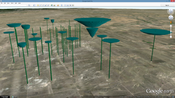
- As with all RockPlot3D diagrams, these plots may be easily exported to Google Earth as shown by the following example depicting cumulative water production over a 15-year period.
 Back to Production Menu Summary

RockWare home page