
! It doesn't make much difference which curve you declare for Curve 1 or Curve 2. Note, however, that Curve 2 will always plot on top of Curve 1.
Logarithmic: Insert a check here if the curve is to be scaled logarithmically (log base 10) within the column. If left un-checked, the curve will be scaled linearly across the column.
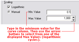
Minimum and Maximum Values: These settings define the range of data values to be represented for this curve in the curve column.
Manual: This is the default setting. This allows you to define manually the data values for each curve to correspond to the left and right column edges via the Min. Value and Max. Value boxes.
- Linear Scaling: Simply type in the data value range to be represented in the curve column. For example, if the column is to contain drilling rate values that are to be plotted from 0 to 60 feet per minute, you would enter "0" for the Min. Value and "60" for the Max. Value.
- Logarithmic Scaling: For the Min. Value, enter the non-negative and non-zero real number to represent the minimum value of the logarithmic curve column. You may then select the appropriate Max. Value using the up- or down-arrows next to that prompt. You are restricted to even logarithmic cycles, such as 0.2 to 2,000, 1 to 10,000, etc.
-
- If Logarithmic Scaling is selected and the program encounters a zero or negative value in the data file, that value will be plotted at the minimum-value edge of the column.
Automatic: Choose this option if you want the curve's minimum and maximum values to be determined automatically by the program, based on the data values, at compile time. LogPlot will scan the data values and set the curve scale to a reasonable min-max range to accommodate the values. For example, if the data ranges from 1.6 to 8.2, it would set the curve column's linear Min. Value to 0 and the Max. Value to 10.
- If you have header/footer column legends linked to the curve, they should be updated appropriately.
- If you have activated automatic value labels, they should be updated appropriately.
- It's important to note that Automatic scaling will probably result in the curve column's min-max value range varying from well to well, based on the data range represented - if it is important that the curve column represents the same data range for all wells in a project, you should use the Manual option.
Direction:
![]() If the data values are to be plotted from the left to the right (e.g. the minimum value along the left column edge and the maximum value along the right column edge), click on the Low to High button.
If the data values are to be plotted from the left to the right (e.g. the minimum value along the left column edge and the maximum value along the right column edge), click on the Low to High button.
![]() If the data are to be plotted from the right to the left (e.g. the minimum value along the right column edge and the maximum value along the left column edge), click on the High to Low button.
If the data are to be plotted from the right to the left (e.g. the minimum value along the right column edge and the maximum value along the left column edge), click on the High to Low button.
Line: Insert a check in this box if you want to plot a line to define the curve. If activated, click on the box to the right to select line style, line thickness, and color.
Fill: Click on this box to select a fill pattern and color. If no fill is desired, select the blank pattern.
Fill Direction: If you have selected a non-blank fill pattern, you can choose whether the curve is to be filled to the left or to the right. This setting operates independently of which direction the curve is actually plotting! See below for some examples.

In the examples on the left, the curves are plotted in opposite directions. Curve 1 is plotted in blue (no fill, and filled), Curve 2 is plotted in red (no fill and filled), with the overlap color set to solid green.
In the examples on the right, the curves are plotted in the same direction (left-to-right), no fill and filled, with the overlap zone in solid green.