 Estimated time: 2 minutes.
A frequency histogram is a graph that displays the distribution of real number values, read from a single datasheet column, by percent or actual occurrences.
! It is assumed that you have opened the "surface_geochemistry.RwDat" file as discussed in the previous lesson.
- Click on the Statistics menu, and choose the Histograms | Single option.
- Data Column: Click on the down-arrow button on this prompt, in the left pane of the window, and select from the list of column names the Gold column to be analyzed. You may need to scroll upwards to see this column name.
- Titles: Expand this heading to establish the diagram titles:
- Primary: Click to the right of this menu item, and into the prompt space type: Gold
- Secondary: Click to the right of this item and type into the prompt space: Surface GeoChem Data Set
- Scaling + Bin Size: Expand this heading.
 Linear: Click in this radio button, and expand this heading.
- Automatic: Choose this linear scaling option. This will set the bins to 1/10th the standard deviation. In your own work, if you prefer to declare the actual number of units for each bin, you can select the Manual option.
 Confirm Range should be disabled.
- Bin Colors: Expand this option to select how the diagram will be colored.
- Discrete: Choose this option. This will apply different colors to the bars in the graph based on their relationship to the mean and standard deviation. You can expand this heading to view the default colors.
- Minimum Filter: off
Maximum Filter: off
 Plot Statistics: Check this box, and expand it
- Font: Click here to set the Size to 2.0 and the text color to your choice.
- Verbose: Check this option.
- Plot X-Axis Labels: Check this setting.
- Plot Y-Axis Labels: Check this option, and expand it.
- Plot as Percentages: Un-check this box. This tells the program to plot actual occurrences rather than percent.
- Statistical Legend: off
- Fixed Width:Height Ratio: off
- Click the Process button at the bottom of the Histogram window.
The program will build the frequency histogram and display it in a new RockPlot2D window on the screen. RockPlot2D is the plotting program for "flat" maps, logs, and other diagrams.
For this type of geochemistry data, the values of interest lie in the Slightly Anomalous and Anomalous groupings, particularly the latter, beyond the mean plus 2 standard deviations.
- Look closely at this group. This plot shows four samples with anomalous (high) gold values.
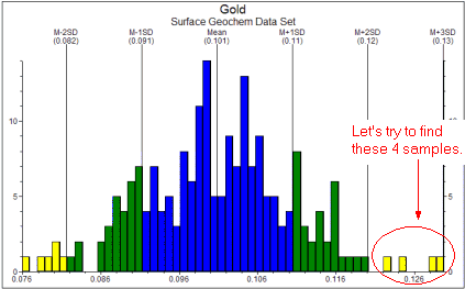
Let's take a look at where these samples lie; the next tutorial lesson teaches you how to build a proportional symbol map, in which those sites with larger gold values are plotted with larger symbols.
- If you wish to save this plot, choose the File | Save command from the RockPlot menu, enter a name such as: gold histogram and click the Save button.
- Close this window (
 ).
).
 Frequency Histograms
 Back to component menu | Next (variable symbol map)

RockWare home page