RockWorks | Utilities | Solid | Statistics | Histogram
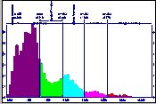
This program is used to get a general summary of the G value distribution within an existing solid model file. The summary is displayed as a plottable frequency histogram of the node values, reported as numbers or percent.
Example of use: If you are creating a solid model of geophysical or geochemical data using different modeling methods, you can create a summary of each model to view the differences in the range of the G-values.
! Be warned that histograms of high-density solid models may take a significant amount of time to create; they may even exceed the capacity of your computer system. (Solid model node counts can get huge: a 100 x 100 x 100 model contains a million node values to process.)
Menu Options
Step-by-Step Summary
Menu Options
- Input (Solid) Model: Click on this item to locate the name of the existing solid model file (.RwMod) to be read and summarized.
- Titles: Enter the primary and secondary titles, if any. (More.)
- Scaling + Bin Size: Expand this to designate the width of each histogram bin as they will be displayed on the histogram plot, and to determine whether the bins are to be displayed at a linear or logarithmic scale. Choose Linear or Logarithmic scaling. The scaling scheme you select will determine your options for selecting the bar widths. Expand the selected item for further options. (More.)
- Bin Colors: Expand this item to select how the histogram bars are to be filled. (More.)
- Minimum Filter: Check this to activate a low-value filter, and expand this heading to define the minimum G value to be included in the histogram.
- Maximum Filter: Check this to activate a high-value filter, and expand this heading to define the maximum G value to be included in the histogram.
- Plot Statistics: Insert a check here to include labels that represent the groupings of histogram bars into mean + and - 1SD, 2SD, 3SD and 4SD. These would correspond to the anomalous colors above. Expand this item to establish the label color and size (as a percent of diagram width.). (More.)
- Plot X Axis Labels: Insert a check here to plot labels along the bottom axis that represent the real number units of the variable being plotted. Expand this item to establish the label color and size (as percent diagram width).
- Plot Y Axis Labels: Insert a check in this box to plot labels along the vertical axis that represent the frequency units. Expand this item to establish the color, size and units.
- Plot as Percentages: Insert a check in this check-box if you want the units to represent percent. If this box is cleared, the units will represent actual occurrences.
- Statistical Legend: Insert a check here to include a legend listing a statistical summary for the data.
Expand this heading to access the legend layout options. (More.)
- Fixed Diagram Width:Height Ratio: Check this box if you wish to define a specific size ratio for the graph, excluding the legend (default 2.0 which representes twice as wide as high).
Step-by-Step Summary
- Access the RockWorks Utilities program tab.
- Select the Solid | Statistics | Histogram menu option.
- Enter the requested menu settings, described above.
- Click the Process button to continue.
The program will read the real number values from the input file, and filter any low or high values if requested.
- If Confirm Range was requested, the range of model G values will be displayed. You can override the minimum and/or maximum entries to extend the range of the axis. For example, if the data range as displayed in the window is 21 - 74, then that would be the range of the horizontal axis if left unchanged. If overridden to 0 - 100, then the axis itself would extend from 0 to 100 units. Click OK in the Confirm Range window to continue.
The program will then determine the number of remaining samples that fall into each of the histogram "bins," counting them either as actual frequencies or as percent. If it is a large model, this can take some time (see "!" warning at the top of the page). The completed histogram plot will be displayed in a RockPlot2D tab in the Options window.
- You can adjust any of the diagram option in the pane to the left (adjust color scheme, change scaling, etc.) and then click the Process button again to regenerate the histogram.
! Each time you click the Process button, the existing display will be replaced.
- View / save / manipulate / print / export the diagram in the RockPlot2D window.
 Back to Solid Menu Summary

RockWare home page