Tutorial: Create a Point Map with Variably-Scaled Symbols

Estimated time: 5 minutes.

Variably-scaled symbol maps are point (symbol) maps in which the size of the symbols vary according to a measured value at each site, read from the main datasheet. This can be an effective tool to visualize quickly sites with low versus high values.

! It is assumed that you have opened the "Maps_Surface_Geochemistry" data file as discussed in the first lesson of this section.

  1. Choose the Utilities | Maps | Point Symbols menu option.
  2. Symbol Options: Start on this tab to set up the map data source and symbols.
    1. XY Columns: Be sure the columns are set as shown below. (If the wrong column title is displayed, just click on the down-arrow and scroll up or down to the correct column title.)
      1. X (Easting): Easting
      2. Y (Northing): Northing
    2. Symbols: Be sure this option is checked so that the map will include location symbols.
      1. Uniform: Uncheck this
      2. Column-Based: Check this option. This tells the program to use symbols stored in a column in the datasheet to represent the map locations.
        • Symbol Column: Choose the datasheet column named Symbol.
        • Dimensions:
          • Variable: Choose this option to request that the symbols be sized differently, based on a measured value.
            • Data Column: Click here and choose Gold. This tells the program to look at the values in the Gold column to know how to scale the symbols.
            • Range: Click in this radio button.
              • Minimum: Type in: 0.25
              • Maximum: Type in: 5.0
                These settings indicate that the sample site(s) with the smallest measured Gold value is to be displayed in the map with its symbol sized at 0.25 percent of the map width. The sample site(s) with the largest Gold value is to be plotted with its symbol sized at 5 percent of the map width. All sites with Gold values in between the minimum and maximum are to be plotted with their symbols scaled in a linear fashion between these extremes.
      3. Circles: Unchecked.
      4. Table-Based: Unchecked.
      5. Images: Unchecked.

        RockWorks variable symbol map

    3. Symbol Labels: Unchecked
  3. Map Layers: Turn on/off the following map layers.
    1. Background Image: Unchecked.
    2. Labeled Axes: Check this item and click this tab.
      • Dimensions: Set this to Automatic. This will scale the map border to fit around the map components.
    3. Map Overlays: Unchecked
    4. Other 2D Files: Unchecked
    5. Peripherals: Unchecked
    6. Border: Unchecked
  4. Click the Continue button at the bottom of the window to create the map.

    RockWorks will scan the datasheet, determine the location coordinates for each sample site, and create a point map with symbols and border annotation. The symbol types are read directly from the main datasheet. Their size is determined by the Gold value listed for each site.

    The completed map is displayed in a new RockPlot2D tab in the options window.

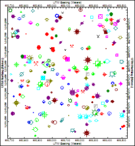
    You may have noticed that this map looks a little busy. With all of the different symbols, colors, and sizes, it's difficult to see anything in particular standing out, especially our four samples of interest among 299 others. Let's create another map with slightly different settings.

  5. Click on the Options tab in the upper-left corner of the window, to return to the menu settings.
  6. Click on the Symbol Options tab.
  7. Click the Symbols tab.
    1. Column-Based: Remove the check-mark from this option.
    2. Table-Based: Instead, insert a check in this option, in the lower-right corner of the window. This tells the program it is to scale the symbols based on listings in a "Range Table."
      1. Z-Column: Click here and choose the Gold column.; As before, the program will scale the symbols based on their gold assays.
      2. Range Table: Click on this button, and click on the Gold table.
      3. Click the Edit Table button to the right - let's take a quick look at this table.

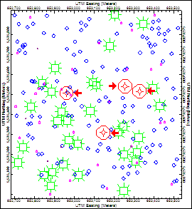
        This range table is set up according to the mean and standard deviations as displayed in the histogram in the previous lesson. For example, sites with Gold values ranging from 0 to 0.082 will be plotted with the small circle, in black, at a size of 0.5 percent of the map width. Sites with Gold values ranging from 0.120 and above will be plotted with circle symbols in red at a size of 9 percent of the map width. This is the range that includes the four samples of interest.

      4. Click on the Exit button in the Point Map Range Table Editor.
  8. Click on the Continue button at the bottom window.

    RockWorks will create another point map of the "Surface Geochemistry" data set, this time using the symbols declared in the Gold Pointmap table at the declared sizes and colors. This time, the four red circles really stand out!

  9. Save this plot if you wish by choosing the RockPlot File | Save menu option, entering a name such as:   Gold map   and clicking the Save button.
  10. Close this window using the Close button (X). You do not need to save the other map.

  Point Symbol Maps


  Back to component menu     |     Next (ternary diagram

RockWare home page