The Custom Production Graph Options dialog box is accessed from the Production Graph Options window.
Menu Options
- Custom Layout: Click on this tab to choose which graphs to include in the output plot. You can activate up to 10 foreground graphs and up to 10 background graphs. Each row represents a single graph in the individual or combined plot.
- Graph Options: Click on this tab to access the symbol, line, fill, axis, border, and dimensions settings for each graph type.
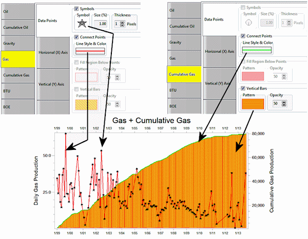
- Data Points:
- Symbols: Check this to include symbols at the measurement points. Click on the Symbol picture to choose the symbol style and color. The Size is defined as a percent of the diagram size (default = 1). Thickness of the lines comprising the symbol design is defined in pixels.
- Connect Points: Check this box to draw a line between adjacent symbols. Click on the picture to choose the line style, thickness, and color.
- Fill Region Below Points: Insert a check here to fill the graph below the points. Click on the Pattern sample to choose the pattern design, density, and foreground and background colors for the fill. Use the first pattern design (#0) for no pattern design; the background color will be used for the fill. Use the Opacity setting to make the fill fully opaque (100) or fully transparent (0).
- Vertical Bars: Check this to display vertical bars for the measurements. Click on the Pattern sample to choose the pattern design, density, and foreground/background colors for the bar fill. As above, choose the first pattern block for no design and the background color will be used for the fill.
- Horizontal (X) Axis: Click on this tab to set up the horizontal axis options.
- Title: Type in the text to be displayed as a title along the horizontal axis. The Font Size is expressed as a percent of the diagram size. Choose a position of base and/or top by checking the appropriate boxes.
- Labels: These settings control the display of time labels across the bottom of the graph. Font Size represents percent of the diagram size. Choose a Position at the base and/or top of the graph. Click on the Orientation drop-down to choose the label direction. Click on the Month Format drop-down to choose how the month label are to be displayed. Click on the Year Format drop-down to set the format for the year labels.
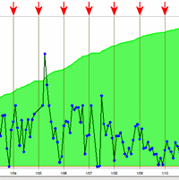
- Dividers (Vertical): Check this box if you want vertical lines to extend through the plot at the frequency of the labels. Click on the line preview box to choose the line style, thickness, and color.
- Vertical (Y) Axis: Click on this tab to establish the vertical axis settings.
- Axis Title: Type in the text to be displayed along the axis. Set the Font Size as a percent of the diagram size; click on the Color box to choose text color. Choose Left and/or Right for the location of the axis label. Set the Orientation - Horizontal or Vertical - by clicking in the appropriate button.
- Manual Range (versus Automatic): Check this box if you want to specify a specific value range for the Y Axis, and type in the minimum and maximum values (specific to the data type).
- Axis Labels: Set the Font Size as a percent of the diagram size, and choose the position for the value labels: left and/or right sides.
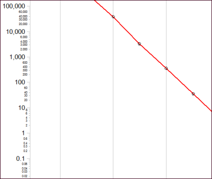
- Logarithmic Scaling: Check this box to display the value labels on a logarithmic rather than linear scale.
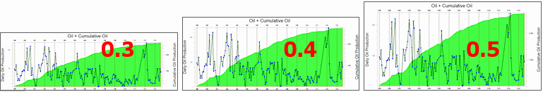
- Label Minor Intervals: If logarithmic, you can use this setting to display minor interval labels, as shown here. Depending on the size/shape of the graph, RockWorks will display as many labels as it can without overplotting.
- Border: Click on this tab to choose the line style, thickness, and color for the chart's border.
- Dimensions: Click on this tab to define the vertical:horizontal Aspect ratio of the graphs.
 Back to Graph Types
RockWare home page