RockWorks | Borehole Manager | P-Data |
Analyze | P-Data Histograms by Lithology
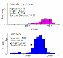
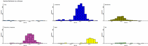
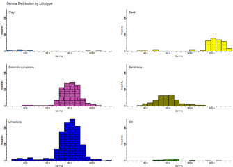
Use this program to read the values in a P-Data column and generate a series of frequency histograms that display the distribution of these values for each lithology type recorded downhole for the active boreholes in the project. The diagrams are generated on a single page for quick comparison. You can generate diagrams for all or for selected lithology types. The resulting diagram is displayed in a RockPlot2D pane within the Options window.
Feature Level: RockWorks Standard and higher
Menu Options
Step-by-Step Summary
Menu Options
- P-Data Track: Click to the right to select the existing P-Data column that contains the measurements to be analyzed.
- Lithology Types: Click here to view the existing Lithology Types table in the current project.
! RockWorks will only generate frequency histograms for those lithotypes with check-marks in their "Show in Legend" column. This is an easy way to limit the number of material types for which the P-Data graphs will be generated.
- Annotation: Expand this heading to establish how the diagrams will be labeled.
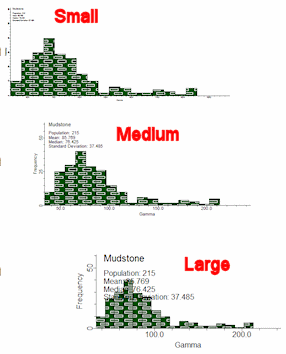
- Size: Choose from Small, Medium, or Large, or click in the Other radio button and type in the preferred text size (as a percent of the project size).
- Axis Titles: Check this box to include the word "Frequency" along the vertical axis of each graph, and the name of the P-Data track along the horizontal axis.
- Statistical Annotations:
- Shade Statistical "Background": Click this box to display the range between the Outlier Thresholds (defined below) with a user-selected color. This can be a quick visual reference for anomalous values.
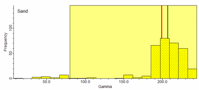
- Show Mean as Vertical Line: Check this box to display the mean value for each histogram with a vertical line. You can choose the line style and color. In the above example, the mean is represented with a red line.
- Show Median as Vertical Line: Check this box to display the median value for each histogram with a vertical line. You can choose the line style and color. In the above example, the median value is shown with a green line.
! Note that you can select how the background and outlier data are defined using the Outlier Thresholds option, below.
- Horizontal Axis: Expand this heading to set the scaling for the horizontal axis.
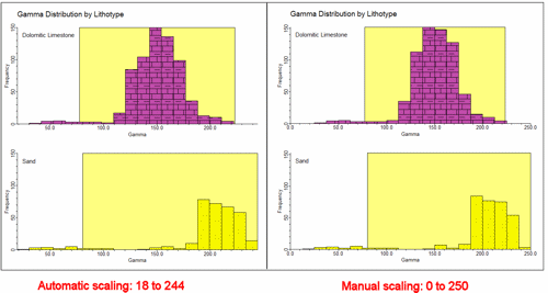
- Automatic: Choose this option to have the program determine automatically the minimum and maximum P-Data value to be represented along the horizontal axis of all graphs, based on the range of P-Data values present for the lithology types that are analyzed. Generally this is the easiest method, but if it's important that a specific range be represented, choose Manual, below.
- Manual: Choose this option to define the minimum and maximum P-Data values to be represented along the horizontal axis. Expand this heading to enter the minimum and maximum values.
- Vertical Axis: Expand this heading to select scaling for the vertical axis of the histogram plots.
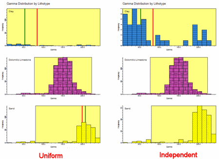
- Uniform: Choose this option if all histograms are to represent the same frequency range along the vertical axis. This is generally recommended so that all of the individual graphs in the large composite diagram have the same scaling.
- Independent: Choose this option if each histogram for each lithology type is to be scaled independently for the vertical axis. This can be helpful if you have some lithotypes which skew the scale to a high frequency range, rendering others barely readable. Just remember that the scale for each may be different as you view the analyses.
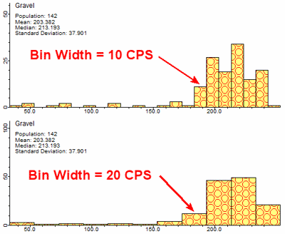
- Bin Size:
- Automatic: Choose this option to set the width of the histogram bins (columns) automatically, by scanning all of the P-Data, computing the range of data, and dividing the range by the number of specified bins. Expand this heading to enter the number of bins to be created.

- Manual: Choose this option to set the width of the histogram bins using actual P-Data units. For example, a bin size of 20 would equal 20 counts per second when processing Gamma data.
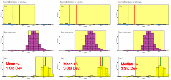
- Outlier Thresholds: Use these settings to define what is considered to be an outlier. The default setting is Mean +/- 3 Standard Deviations. If you choose fewer Std Deviations, this will narrow the range of background data and widen the range of outliers. If you choose to define background and outliers using the Median, you may find relatively more outliers since the Median is less sensitive to outliers than is the Mean.
- Diagram Dimensions: This setting (specified in inches) effectively determines the aspect (height/width ratio) of the individual histograms.
- Diagrams Per Column: The histograms are plotted starting in the upper-left corner and added successively downward until the Diagrams Per Column setting has been reached and then a new column is started immediately to the right of the preceding column. In this example, Diagrams Per Column is set to 2.
In this example, Diagrams Per Column is set to 3.
- Create Report: Insert a check here to create a report that lists a detailed summary of each of the lithology types.
- List Outliers: Check this option to include information about "outliers". These outliers represent P-Data measurements that lie outside a statistical range, as defined under Outlier Thresholds, above. For each lithotype, the program will list the borehole ID, depth, and P-Data values.

Step-by-Step Summary
- Access the RockWorks Borehole Manager program tab.
- Enable/disable the boreholes to be processed by inserting/removing checks from the boxes next to their names.
- Activate the lithology types to be processed by inserting/removing checks from the Lithology Types table's Plot in Legend check-box. (You can also access the Lithology Types table from within this program's Options window.)
- Select the P-Data | Analyze | P-Data Histograms by Lithology menu option.
- Establish the desired menu settings, as discussed above.
- Click the Process button to proceed with diagram generation.
The program will read the contents of the input P-Data track for each borehole and determine the corresponding lithology material at each measurement location. For each active lithology material types, it will build a frequency histogram showing the range of the P-Data values. The colors and patterns that are used to plot the histograms are based on the color/pattern assignments that are defined within the Lithology Types Table. These individual graphs will be combined into a composite diagram, displayed in a RockPlot2D tab in the Options window.
If you have requested an outlier report, it will be displayed in a text tab in the Options window.
- You can adjust any of the settings in the pane to the left and then click the Process button again to regenerate the histogram and the report.
! Each time you click the Process button, the existing display will be replaced.
- View / save / manipulate / print / export the image in the RockPlot2D window.
 Back to P-Data Menu Summary

RockWare home page