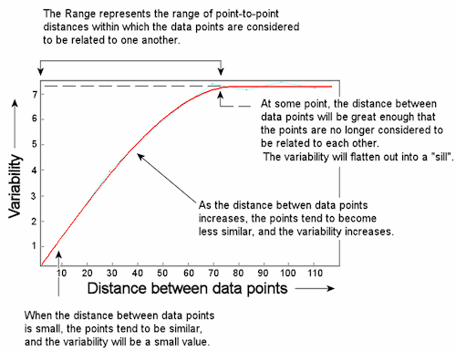
A Variogram is used to display the variability between data points as a function of distance. An example of an idealized variogram is shown below.
This variogram represents the variability between data points that lie along a 45 degree (+/- 10 degree) bearing from each other. Reading this variogram shows the following variability:
| Point-to-Point Distance | Variability |
| 2.5 m | 0.5 |
| 10 m | 1.25 |
| 35 m | 4.5 |
| 50 m | 5.9 |
You might say that along this orientation, closely-spaced data points show a low degree of variability while distant points show a higher degree of variability. At some distance, in this case 72 meters, the differences between points will become fairly constant and the variogram will flatten out into a "sill." From 0 to 72 meters of distance, the data points can be considered "related," and this expanse is called the "range."
The "relatedness" of close points is not a huge surprise. But, are points more related in one direction than another? A similar variogram can be constructed for the same data set for data points that lie in a different direction from each other. For example, at a bearing of 135 degrees (+/- 10 degrees), the variogram might look like this:
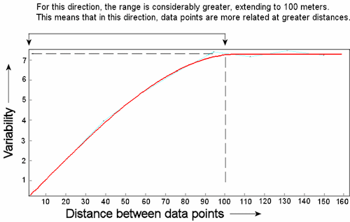
Along this bearing:
| Point-to-Point Distance | Variability |
| 2.5 m | 0.25 |
| 10 m | 1 |
| 35 m | 3.5 |
| 50 m | 4.5 |
The Range for this variogram is 100 meters - considerably larger than the range in the previous example. This means that data points along this bearing can be considered to be more similar at greater distances from each other.
In RockWorks, the number of bearings for which a variogram will be constructed will depend on whether you're running it on Auto or Manual. Under Automatic Kriging the program will sample the data at 90-degree spacing and reduce the spoke spacing incrementally to find the best correlation. Under Manual Kriging, you can define the spoke spacing.
Variogram Models
RockWorks first generates a series of observed variograms for your raw data, calculating the variance between points at the specified distance increments and along each specified bearing.
The observed variograms, which represent your source data, are then fit to each of the 8 types of variogram models within the program. This is so that the data, which were sampled at discreet units, can be modeled as a continuous function, and the value for any unknown point at any distance can be interpolated. Once the best fit has been made, the "goodness of fit" is represented by a correlation coefficient for each variogram type. (Positive correlations indicate direct relationship between variance predicted by the variogram versus the lag variances with 1.0 being perfect. Negative correlations indicate inverse relationships. Zero indicates no relationship.) The variogram models available within RockWorks are shown below.
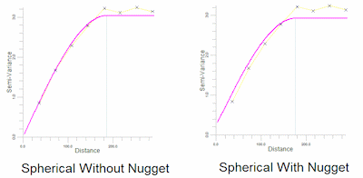
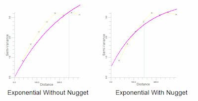
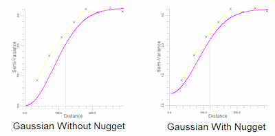
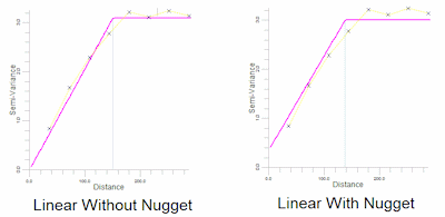
One way you might conceptualize the nugget effect is to imagine that you are measuring geochemical data, and the size of your rock samples are about 1 mm in diameter. At very close distances, let's say 1 mm, the samples are likely to be very similar. On a variogram plot, the variance will probably go through the origin, and there will be no nugget effect. If, in contrast, your samples are 10 cm in diameter, the smallest sampling distance you can even get between points is 10 cm - a distance over which there may be much greater variability. The size of the sample or "nugget" itself gets in the way of determining variability at very close distances. By enlarging the sample size ot a watermelon or a Volkswagen, you may begin to get the picture of the effect of the size of the nugget or the sampling interval on the appearance of the variogram, and its relation to the margin of error in your data.
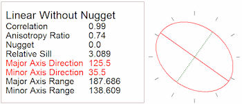
Directionality Ellipse (aka Anisotropy Ellipse or Range Plot)
Once the observed variograms have been fit to each of these variogram models, the correlation can be reported, and the ranges for each direction determined. One method for illustrating the comparative ranges in all directions the Directionality Ellipse below. Note the directionality that becomes apparent when viewing data in this way. The "major axis" lies at 125.5 degrees and the "minor axis" at 35.5 degrees.
Selecting the variogram to use
The most obvious factor on which to make this decision is the correlation shown between a particular variogram and your data. The higher the correlation, the better the fit, the more accurate the model, and the more accurate the kriged grid. If you find that a number of variogram types show virtually the same goodness of it, then it's very likely that the grid that is kriged from any one of them will appear almost identical to the grid kriged from any of the others, making the decision rather arbitrary. Do note, though, that because the correlation coefficient is a representation of the correlation between the variogram and the lags, improperly selected lag dimensions (Manual kriging) won't necessarily be reflected by the correlation coefficient. In fact, very bad lag dimensions can produce high correlation coefficients.
One other factor you might consider is the effect of the nugget in the resulting grids and ultimate contour maps. If you recall from the earlier discussion the nugget effect illustrates the error in your date. When the nugget effect is allowed in a variogram, the resulting data grid may ultimately generate contours which do not honor the control points. It can't help it - it's simply showing you the error in your data. If you get such a contour map AND if this is unacceptable, then you should opt for re-kriging the data grid using a variogram with a suppressed nugget.
![]() Back to Kriging
Back to Kriging
![]()