RockWorks | Utilities | Stats | Ternary Diagram
This program is used to generate trilinear diagrams based on three columns of data. Options include the ability to contour point densities, plot unique sample symbols, and control diagram annotation.
See also: Ternary Map for displaying these diagrams for multiple sites in a map layout.
Menu Options
Step-by-Step Summary
- Data Columns: Click on this tab to select the input data.
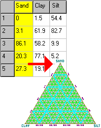
- Upper Vertex: Select the name of the datasheet column whose values are to be associated with the upper vertex in the diagram.
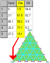
- Left Vertex: Select the name of the datasheet column whose values are to be associated with the lower-left vertex of the diagram.
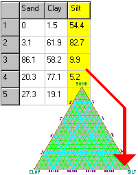
- Right Vertex: Select the name of the datasheet column whose values are to be associated with the lower-right vertex of the diagram.
- Titles
- Primary: Enter the text to be displayed as the main title at the top of the diagram. If no title is desired, delete all text in this prompt.
- Secondary: Enter the text to be displayed as the secondary title at the top of the diagram, below the primary title. If no title is desired, delete all text in this prompt.
- Diagram Options
- Vertex Titles: To omit any of these labels, simply delete any text listed in the field(s).
- Upper: Enter the text to be used to label the upper vertex of the triangle. Be sure this matches the data itself, declared in the Data Columns tab.
- Left: Enter the text to be used to label the left vertex of the triangle. Be sure this matches the data selected for this vertex, declared in the Data Columns tab.
- Right: Enter the text to be used to label the right vertex of the triangle. Again, check that this matches the actual data selected for this vertex, in the Data Columns tab.
- Subdivisions: Click this tab to turn on/off the major and minor divider lines, and (if on) to select their line style, thickness, and color. (More info)
- Perimeter: Choose a line style, color, and thickness for the triangle's perimeter line.
Choose the color for the interior of the diagram (default = white).
- Axis Labeling: Insert a check here to include labels along the perimeter of the triangle. Select the intervals at which the perimeter labels will be plotted: at 10% increments (fewer labels) or 20% (more labels).
- Tick-marks: Insert a check here to display tick-marks along the diagram border. Choose the increments (10% or 20%) and locations (inside the triangle or outside).
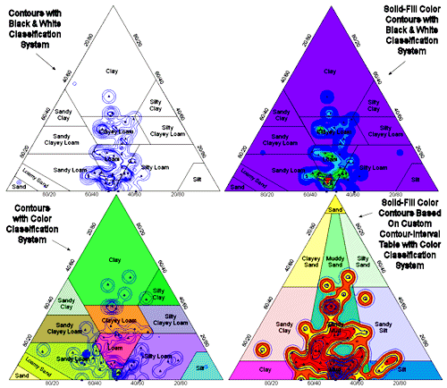
- Classification Overlays: Insert a check here to plot one of the available classification systems as color-filled or black and white polygons in the background, with your points, labels, and/or contours in the foreground. (More info)
- Font Size & Colors: Click this tab to access size and color settings for some diagram components.(More info)
- Symbols: Insert a check here to display the samples with symbols on the diagram. (Which is the whole point, yes?) You can choose from uniform symbols, or unique symbols declared in the data file. (More info).
- Symbol Labels: Check this item to display specific labels with each symbol. Click this tab to access the label options. DON’T turn labels on if you have a lot of points or the plot will be unreadable. (More info)
- Contours: Click this tab to access diagram gridding and contouring settings.
- Gridding Options: The gridding options are used only if you have requested color contours, line contours, labeled cells, or gradient vectors. They determine how the triangular area should be subdivided in order to count the number of occurrences per cell.
- Grid Density: The grid density defines the resolution of the contouring. A fine grid will highlight individual points while possibly disguising the overall trend, while a coarse grid may highlight the trend but blur the individual points. Experiment.
-
It’s worth noting here that the line contours and/or color-filled intervals represent point density as the number of points per grid cell. Obviously, the larger the grid cell (less dense the grid) the more points will be found in the cell. Finer grids with smaller cells will contain fewer points. We recommend that you utilize the line and color-filled contours more for an overall view of point density patterns than for quantitative comparisons unless you are sure to keep the grid density constant.
- Smoothing: When activated, this tool is used to average the point densities contained in the temporary grid model, to lessen density differences between neighboring grid cells. (This is different from contour line smoothing which smoothes the contour lines themselves as they are being generated.)
- Filter Size: This setting defines how many adjacent nodes should be used when computing the average (smoothed) Z-value for each grid node. If you enter "1", then each node will be assigned the average of itself and the 8 nodes immediately surrounding it, 1 layer deep. If you enter "2", the node will be assigned the average of itself and the 24 nodes immediately surrounding it, 2 layers deep. When in doubt, enter "1".
- Iterations: Enter the number of times the entire model should be run through the smoother.
- Colored Intervals: Insert a check to compute the point density in the diagram (using the grid density, above) and to represent this with color-filled intervals. Click this tab to access the color-contour options.
- Contour Lines: Check this option to compute the point density in the diagram and represent that with line contours. Click this tab to access the contour options.
- Other 2D Files
Check this option to include existing RockWorks diagrams as layers with the current diagram.
Click on this tab to select the existing diagrams (.Rw2D files) to be included. (More info)
- Peripherals
Check this option to include various peripheral annotations with your diagram. Options include titles, and more.
Click on this tab to activate the items and establish their settings. (More info)
- Border
Check this option to include a solid line border around the entire diagram.
Click on this tab to specify the line style, thickness, and color.
- Output Options
- Save Output File: Check this to assign a name for the diagram in advance, rather than displaying it as Untitled.
- Automatic: Choose this option to have RockWorks assign the name automatically. It will use the name of the current program plus a numeric suffix, plus the ".Rw2D" file name extension.
- Manual: Choose this option to type in a name of your own for this file.
- Display Output: Check this option to have the resulting diagram displayed in RockPlot2D once it is created.
- Access the RockWorks Datasheet program tab.
- Enter/open/import your data into the datasheet. Be sure that the file contains at least three columns of data to be displayed in the ternary plot.
- Select the Utilities | Stats | Ternary Diagram menu option.
- Enter the menu settings, described above.
- Click the Process button to continue.
The program will scan the data sheet, locate the data for each variable, and normalize these data for each sample such that they add up to 100. The relative percentage of each variable within each sample will be plotted as a point on the ternary diagram (if symbols were selected). Labels, contours, and background components will be added as requested. The completed diagram will be displayed in a RockPlot2D tab in the Options window.
- You can adjust any of the diagram options along the left and click the Process button to regenerate the ternary plot.
- View / save / manipulate / print / export the diagram in the RockPlot2D window.
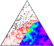
Note that by adjusting various contour parameters and backgrounds, a variety of interesting effects may be achieved:
 Back to Statistics Menu Summary
RockWare home page