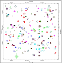
The Point Symbols layer is available for 2-dimensional maps and diagrams. It is used to create a map layer that illustrates the sample locations with symbols, labels, and/or images.
! Note that this program reads the symbol locations (and other items) from the current Datasheet file.
XY Columns
Symbols
Symbol Labels
 Point Symbols
Check this item to plot a Point Symbols layer on your map (also called bubbles).
Click on this tab to establish the settings.
! Note that you can activate multiple symbol types, vector and/or raster.
- XY Columns
Click here to define the columns in the current datasheet that contain the symbol location coordinates.
- X (Easting): Click to select the name of the column in the datasheet which contains the X or Easting coordinates where the symbols will be plotted.
- Y (Northing): Click to select the name of the column in the datasheet which contains the Y or Northing coordinates for the symbols.
- Uniform Raster Symbols: Check this option to plot a selected raster symbol design for all map locations.
- Symbol: Click the graphic to select the symbol to be used.
- Dimensions: Use these settings to define the size of the map symbol. See Symbol Dimensions, below.
- Column-Based Raster Symbols: Check this option to plot the symbols listed in a datasheet column for the map locations. Note that you can activate multiple symbol types, raster and vector.
- Symbol Column: Select from the drop-down list the name of the column in the current datasheet where the raster symbol designs are defined.
- Dimensions: Use these settings to define the size of the map symbol. See Symbol Dimensions, below.
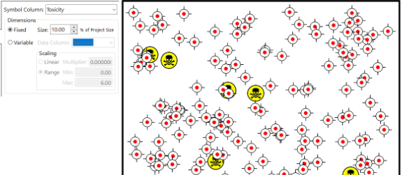
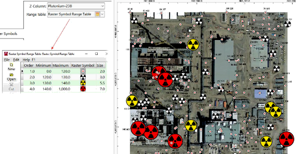
- Table-Based Raster Symbols: Check this option to have RockWorks read a user-created table that lists specific raster symbols for different quantitative values measured at the sites. This option requires that you have created a "Raster Symbol Range Table" in which you have listed ranges of Z-values and the specific symbols to be plotted at the map sites where the listed Z-values fall within that range.
- Z-Column: Click here to select the column in the datasheet where these Z-values, used to define the size and style of the map symbol, are listed. If, as the program is constructing your point map, it finds no z-values that fall within the ranges you have listed, then no symbols will be plotted.
- Range Table: Click here to select the Raster Symbol Range Table you have created. Raster Symbol Range Tables can be viewed and edited from within the map dialog box, or under the Project Tables | Map/Model Tables heading in the Project Manager pane or program tab. See Raster Symbol Range Tables for more information.
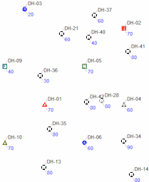
- Uniform Vector Symbols: Check this box to use one vector symbol design and color for all locations.
- Symbol: Click on the sample to display the current symbol library where you can choose a symbol design and color.
- Dimensions: Use these settings to define the size of the map symbol. See Symbol Dimensions, below.
-
Uniform symbols, Fixed dimensions
- Column-based Vector Symbols: Check this option for the program to read specific symbols (styles and color) for each sample site, listed in a symbol column in the RockWorks datasheet.
- Symbol Column: Click here to see a list of all of the columns in the current datasheet; select the name of the column that contains the symbol designs.
- Dimensions: Use these settings to define the size of the map symbol. See Symbol Dimensions, below.
Column-based symbols, Fixed dimensions
- Table-Based Vector Symbols: The program reads a user-created table that lists specific symbols for different quantitative values measured at the sites. This option requires that you have created a "Range Table" in which you have listed ranges of Z-values and the specific symbols to be plotted at the map sites where the listed Z-values fall within that range.
- Z-Column: Click here to select the column in the datasheet where these Z-values, used to define the size and style of the map symbol, are listed. If, as the program is constructing your point map, it finds no z-values that fall within the ranges you have listed, then no symbols will be plotted.
- Range Table: Click here to select the Range Table you have created. Range Tables can be viewed and edited from within the map dialog box, or under the Misc. Project Tables heading in the Project Manager pane along the left edge of the program window. See Range Tables for more information.
-
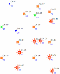
Table-based symbols (dimensions are defined in table)
- Bubbles: The Bubbles option will plot either filled or unfilled bubbles that are centered at the designated xy coordinates. The radii of these bubbles are based on the values within a "Z-column" that you select. (These are frequently called "bubble maps". Typically, the Z-column is used to define some parameter that is expressed in the same units as the X,Y coordinates. Examples include radii of influence and effective pumping radii.)
- Dimensions: Use these settings to define the size of the map symbol. See Symbol Dimensions, below.
- Color: Controls the color of the bubble outline ("perimeter") and fill, if selected.
- Monochrome: Choose this to plot all bubbles with the same color; click on the color box to select the plot color.
- Defined within Data Column: Choose this to vary the circle colors, based on color declarations in the data file. Click the drop-down list to see all of the columns in the current datasheet; select the name of the column that contains the colors.
- Continuous (Based on Data Range): Check this option to grade the symbol colors based on values in the current datasheet.
- Data Column: Select the name of the column containing the measured values which are to determine the bubble colors.
- Minimum Color: Click the color box to choose the color for the bubbles with the minimum data value.
- Maximum Color: Click the color box to select the color for the bubbles with the maximum data value. Bubbles at locations with intermediate data values will be graded between these two colors.
- Fill Style:
- Fill: Choose this option to fill the bubbles (using the color defined above).
- Perimeter: Check this to plot a line around the bubble perimeter.
- Style: Click to choose the line style, thickness, and color for the bubble perimeter.
- Hollow: Choose this to leave the bubbles unfilled.
- Perimeter Thickness: This setting defines the line thickness for the bubble outlines. "1" would represent a thin line, "3" thick.
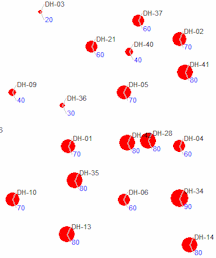
Bubble symbols, Variable / Linear dimensions
-
- Images: Check this box to include scaled images underneath the map symbols, with image names pulled from a column in the Utilities datasheet. Note that the images are plotted on the lower "layer", meaning that any other sample information, such as the sample symbols and labels, are plotted on top of the images.
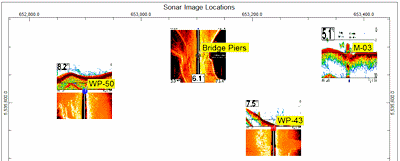
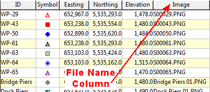
- Column that Contains Image File Names: Click here to see a list of all of the columns in the current datasheet; select the name of the column that contains the image file names. An example is shown below; you would choose the column named "Image".
-
- Image Dimensions based on... Use these settings to define the image size on the map. Note that the images will be rescaled to fit the desired size.
- Map Units: Click in this button to define the image size in actual map units, and enter the desired width and height. For example, if you were to enter "50" for both, then the images will be resized to occupy 50 units both horizontally and vertically on the output map. The benefit of this method is you'll know exactly how big the image will be on the map that RockWorks creates.
- % of Project Size: Click in this button to define the image size as a percent of your project size, and enter the desired width and height percent. The benefit of this method is that image sizes will be fairly consistent between projects.
- Symbol Dimensions. The options are consistent for the Vector and Raster Uniform, Column-based, and Bubble symbol styles.
- Uniform: Symbols will be the same throughout the map. The size is declared as a percent of the project size. In this way, the symbols will be about the same size for even wildly different data sets.
- Variable: Symbols can vary in size across the map. The size varies based on a measured value at each map site ("Z-value"). Within this option, you can define:
- Data-Column: Click here to select the column in the datasheet where the measured values, upon which the size of the map symbol will be based, are listed.
- Scaling
- Linear: Choose this option for the Z-value at each map site to be multiplied by a constant value, to determine symbol size in your map units.
! Note: Unlike most size declarations in RockWorks which are relative to the size of the project, this scheme defines the size of the symbol in your actual map units.
- Multiplier: Type in the constant value which will be multiplied by the Z-value at each map site, to determine symbol size.
Simple example: Let's say you wish to display a pumping radius around each well, and that radius, in your map units, is listed in a column in the datasheet. Just select that for the Z-Column, above, and set the scalar to "1" and the symbols will be plotted with a radius equal to those map units.
Another example: You want the map symbols to be scaled based on percent sand (which has been selected under Data Column, above). Since the percents range from 0 to 100, you could enter a scalar of 0.25 to generate symbols sized from 0 to 25 map units in size.
- Range: Choose this option to scale the symbols between two user-defined dimensions. These dimensions are specified as a percentage of the overall project size.; Using this scheme, those map sites with the lowest z-values (declared under Data Column, above) will be represented with symbols plotted at the Minimum size, those sites with the highest z-values will be plotted at the Maximum size, and those in between will be scaled proportionally between the two.
- Minimum: Type in the size for map symbols, as a percent of the project size, for the smallest data values.
- Maximum: Type in the size for the map symbols, as a percent of the project size, for the largest data values.
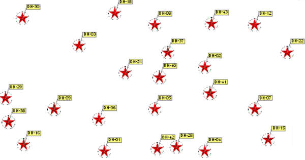
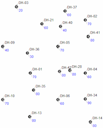
- Symbol Labels
Check this item to include labels with the point symbols. Click on this tab to establish the label settings.
- Content
- Plot Label: Northeast, East, Southeast, etc: Insert a check in the boxes for the labels to be plotted. For example if you want a single label plotted to the northeast of the symbol, you would check the Northeast box. Then, for each activated label, you can define the following:
- Data Column: Click the down-arrow to select the name of the column in the data sheet that contains the information to be plotted as labels. If you wanted the sample ID to be plotted, for example, you would choose the column that lists the sample IDs.; You can select a different column for each activated label.
- Text: Click on the color box to choose a color for the label text.
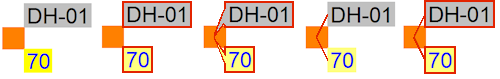
- Fill Bkgnd.: Insert a check here if you want the label to be plotted on an opaque rectangle, and (if so) choose the background color for the label. See also the Perimeter settings, which can include a frame outline, leader line, or pointer from the label to the map symbol.
- Prefix, Suffix: In these prompts, you may type in any alphabetic or numeric characters to be plotted before (prefix) or after (suffix) the label text specified in the selected data column. For example, if the sample ID is entered as "123" and the Prefix is entered as "BH", then the label will print as "BH123"
- Leader Lines: Select label outline options, which will apply to all active labels. You can include a pointer, frame, and/or leader line, and select their color and line styles. These examples illustrate the perimeter options with Northeast and Southeast labels (horizontal orientation).
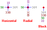
- Orientation: Here you can select the angle of the label text: horizontal (the labels read left to right), radial (angled like a spoke), or block (stacked).
- Dimensions:
- Initial Offset: Click to enter the distance from the map symbol the label should be placed. The offset is declared as a percent of map width, just like the label dimensions. At "0" the label will be placed right next to the symbol.
- Font Size: Choose font size, as a percent of the dimensions of the project area.
- Automatic Offset: Check this to activate automatic label positioning. This positions the point labels so that they do not overplot adjacent symbols or other labels. This method uses a spiraling algorithm whereby labels positions are rotated around the control point until an open "spot" is found. If an open location is not found, the search radius is increased and the entire process is repeated. For best results, use the Horizontal labeling orientation, establish the smallest possible label size (Dimensions) and then activate the automatic positioning. Automatic offset can significantly increase map processing time.

RockWare home page