The Custom Production Graph Options dialog box is accessed from the Production Graph Options window.
Menu Options
Step-by-Step Summary
Menu Options
- Composite Diagram Layout: Click on this tab to choose which graphs to include in the output plot. You can activate up to 10 foreground graphs and up to 10 background graphs. Each row represents a single graph in the individual or combined plot.
- Individual Graph Options: Click on this tab to access the symbol, line, fill, axis, border, and dimensions settings for each graph type.
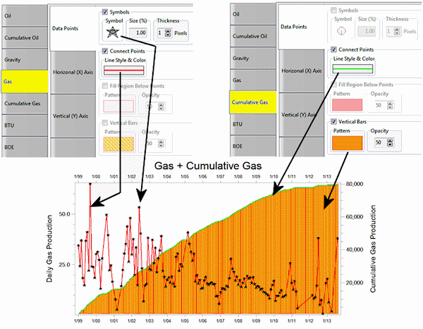
- Data Points:
- Symbols: Check this to include symbols at the measurement points. Click on the Symbol picture to choose the symbol style and color. The Size is defined as a percent of the diagram size (default = 1). Thickness of the lines comprising the symbol design is defined in pixels.
- Connect Points: Check this box to draw a line between adjacent symbols. Click on the picture to choose the line style, thickness, and color.
- Fill Region Below Points: Insert a check here to fill the graph below the points. Click on the Pattern sample to choose the pattern design, density, and foreground and background colors for the fill. Use the first pattern design (#0) for no pattern design; the background color will be used for the fill. Use the Opacity setting to make the fill fully opaque (100) or fully transparent (0).
- Vertical Bars: Check this to display vertical bars for the measurements. Click on the Pattern sample to choose the pattern design, density, and foreground/background colors for the bar fill. As above, choose the first pattern block for no design and the background color will be used for the fill.
- Horizontal (X) Axis: Click on this tab to set up the horizontal axis options.
- Title: Type in the text to be displayed as a title along the horizontal axis. The Font Size is expressed as a percent of the diagram size. Choose a position of base and/or top by checking the appropriate boxes.
- Labels: These settings control the display of time labels across the bottom of the graph. Font Size represents percent of the diagram size. Choose a Position at the base and/or top of the graph. Click on the Orientation drop-down to choose the label direction. Click on the Month Format drop-down to choose how the month label are to be displayed. Click on the Year Format drop-down to set the format for the year labels.
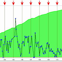
- Dividers (Vertical): Check this box if you want vertical lines to extend through the plot at the frequency of the labels. Click on the line preview box to choose the line style, thickness, and color.
- Vertical (Y) Axis: Click on this tab to establish the vertical axis settings.
- Axis Title: Type in the text to be displayed along the axis. Set the Font Size as a percent of the diagram size; click on the Color box to choose text color. Choose Left and/or Right for the location of the axis label. Set the Orientation - Horizontal or Vertical - by clicking in the appropriate button.
- Manual Range (versus Automatic): Check this box if you want to specify a specific value range for the Y Axis, and type in the minimum and maximum values (specific to the data type).
- Axis Labels: Set the Font Size as a percent of the diagram size, and choose the position for the value labels: left and/or right sides.
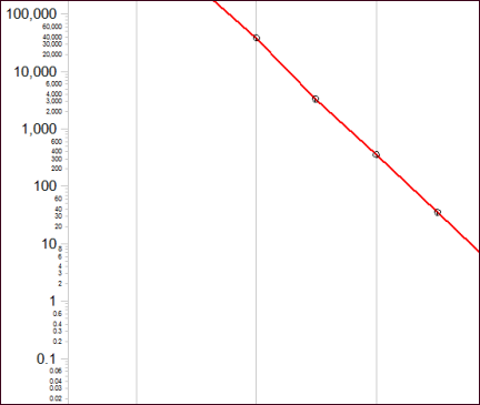
- Logarithmic Scaling: Check this box to display the value labels on a logarithmic rather than linear scale.
- Label Minor Intervals: If logarithmic, you can use this setting to display minor interval labels, as shown here. Depending on the size/shape of the graph, RockWorks will display as many labels as it can without overplotting.
- Border: Click on this tab to choose the line style, thickness, and color for the chart's border.
- Dimensions: Click on this tab to define the vertical:horizontal Aspect ratio of the graphs.
- Additional Options: Expand this heading to define other diagram and conversion settings.
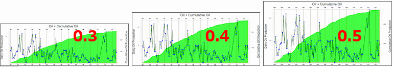
- BOE Conversion Factor: Click to the right to type in the Barrel of Oil Equivalent conversion factor. Gas production values will be mulitplied by this value and added to the Oil production numbers to generate a total production value.
- Date Range: Expand this heading to define the date range for the diagram(s). Choose Automatic for all dates which are listed in the datasheet to be included. Choose Manually Specified if you prefer to define a subset, and expand the heading to select the starting and ending dates.
- Date Labeling Frequency: Use this setting to define the labeling increment for the horizontal (date) axis.
- Master Title: Check this box to display a title at the top of the individual or composite diagram. The Use Datasheet File Name option is the simplest option - the title will be pulled from the name of the current datasheet. Or, choose the Other option and expand that heading to enter a different diagram title (click to the right of the Title prompt). Font size for the title is specified as a percent of the diagram size.
Step-by-Step Summary
- Access the RockWorks Utilities program tab.
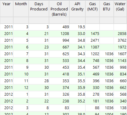
- Create a new datasheet and enter/import your well production data into the datasheet.
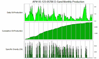
Or, open one of the sample files and replace that data with your own. (In the Samples folder, an example file = "\RockWorks17 Data\ Samples\Production_01.rwDat", shown here.) The Year, Month, and Days Produced columns are required; the other columns shown here are optional.
- Select the Statistics | Well Production | Single Well menu option.
- In the displayed window enter the requested information, discussed above.
- Click the Process button to continue.
The program will read the data from the requested datasheet columns, and generate the requested graph(s). The completed plot will be displayed in a RockPlot2D tab in the Options window.
- You can adjust any of the diagram option in the pane to the left (adjust diagram type, etc.) and then click the Process button again to regenerate the plot.
! Each time you click the Process button, the existing display will be replaced.
- View / save / manipulate / print / export the diagram in the RockPlot2D window.
 Back to Statistics Menu Summary

RockWare home page